Discogs
Discogs is a music database and marketplace that hosts the world’s most active exchange of vinyl records. I redesigned the desktop interface to solve usability issues and enhance the user experience.
Timeline:
Sep 2023 - Dec 2023
Skills:
User Research, Wireframing, Prototyping, UI Design
Tools:
Figma, Illustrator, SurveyMonkey
Type:
Academic, Solo

Problem
The desktop interface has stayed largely the same since the site was launched in 2000. The website has numerous usability issues and doesn’t meet modern web design standards and user expectations.
Objective
The aim is to modernize and enhance the user experience of the desktop interface. A visual revamp will attract new users to the platform, while addressing long-standing issues will please the existing userbase.

User Research
To understand user needs and pain points, I created two surveys. I shared the surveys on the Discogs forum, Facebook groups and subreddits for record collectors.
Survey A focused on the database, with questions about editing and rating releases.
Survey B focused on the marketplace, with questions about buying and selling.
I received 65 responses on the former and 109 responses on the latter, giving me a wealth of data to explore.
Survey Results
One survey result surprised me and challenged my assumptions.
For the Marketplace page, one improvement I had in mind was adding images of the actual record being sold. Users would want that, right? However…
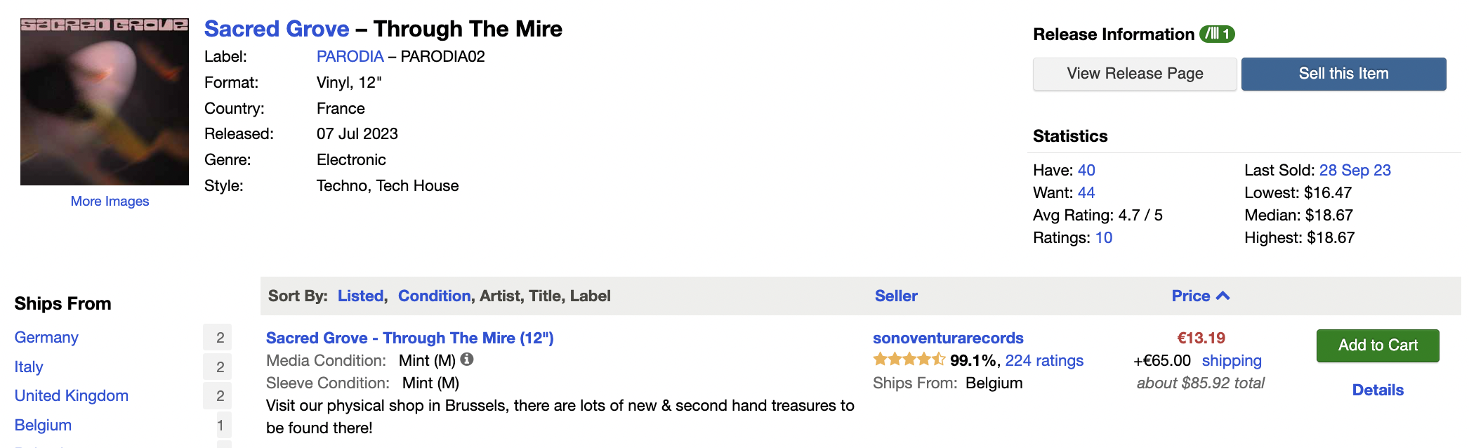
Marketplace Page (Current Interface)
About half the respondents said this was “not at all important” or “not so important.”
When I saw this result I was taken aback. But then I considered how selling works on Discogs.
Each listing has a grading for media condition, sleeve condition, and seller comments. The marketplace relies on a trust system, where the seller’s reputation depends on accurate grading of their records.
Due to this system, buyers don’t need to see images of the actual records they purchase.
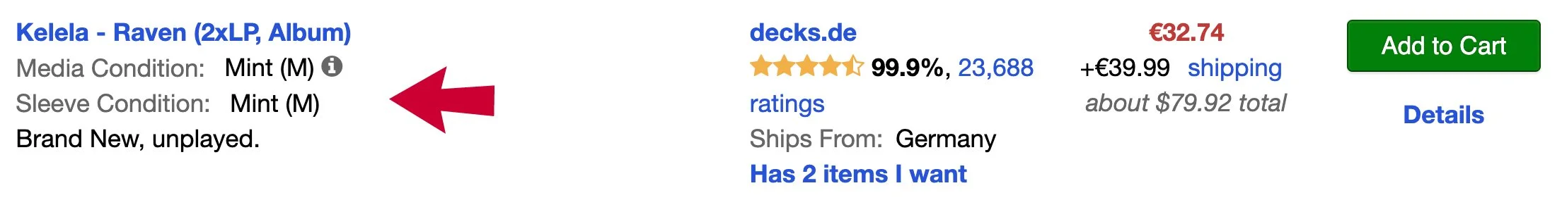
Listing on Marketplace Page (Current Interface)
Survey results such as these steered my design decisions and ensured that the resulting interface is user-driven.
UX Audit and User Interviews
As part of my user research, I also conducted a UX audit and carried out user interviews.
A thorough UX audit helped me identify strengths, weaknesses and pain points in the user experience.
User interviews throughout the project helped me understand the needs of Discogs members.
Redesign Goals for Desktop
Organize the Release page and make it more visually appealing.
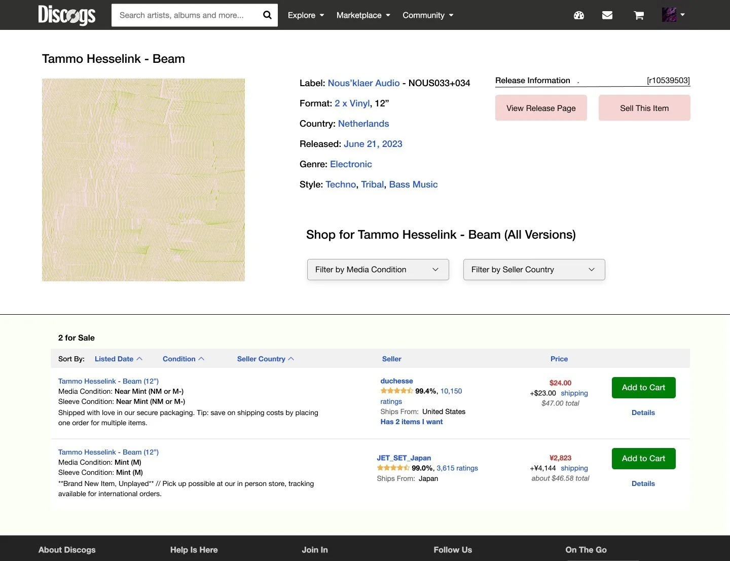
Reposition key filters on the Marketplace page.
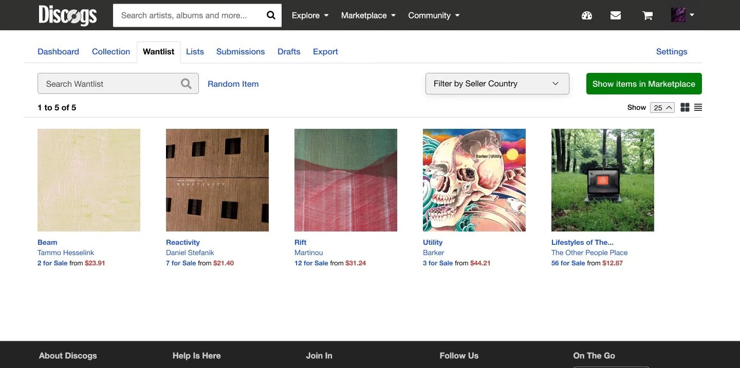
Add a filter for seller country on the Wantlist page.
Why redesign just for desktop?
An iOS app was released in 2015 targeted towards the mobile userbase.
The userbase on mobile is more casual: you can’t edit the database or sell records through the app.
Sketches
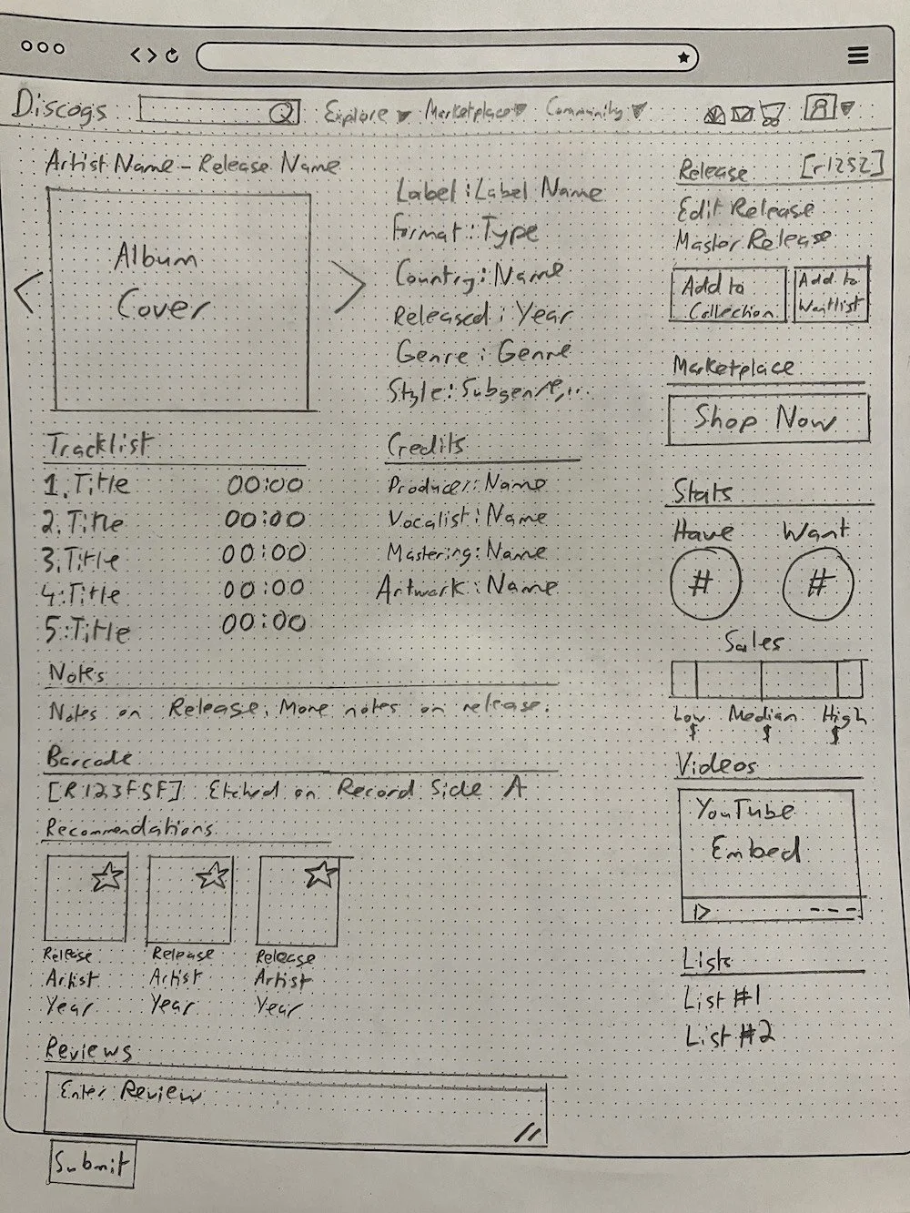
Release Page (Layout A)
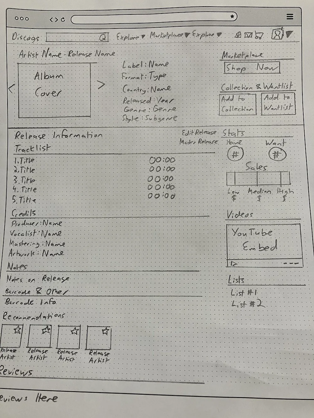
Release Page (Layout B)
Marketplace Page
Wantlist Page and Collection Page
Wireframes
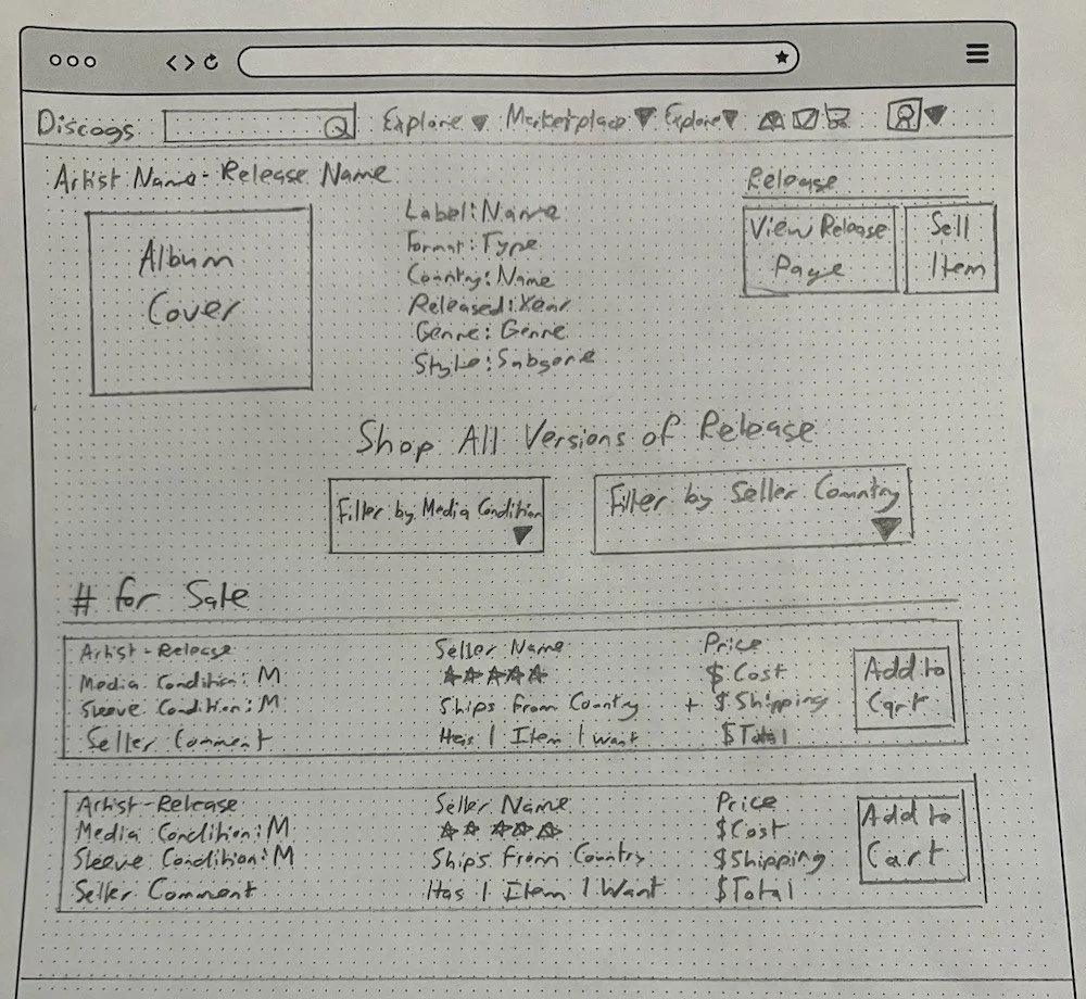
Release Page
Marketplace Page
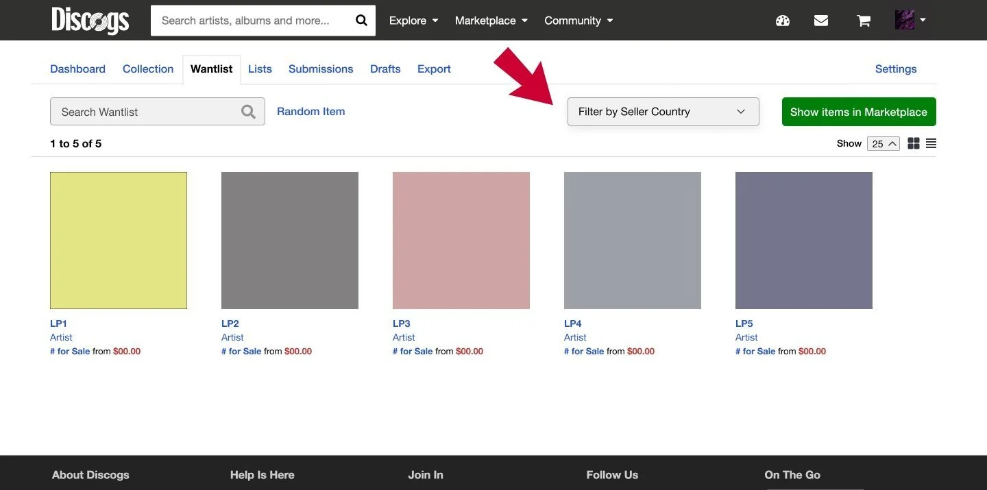
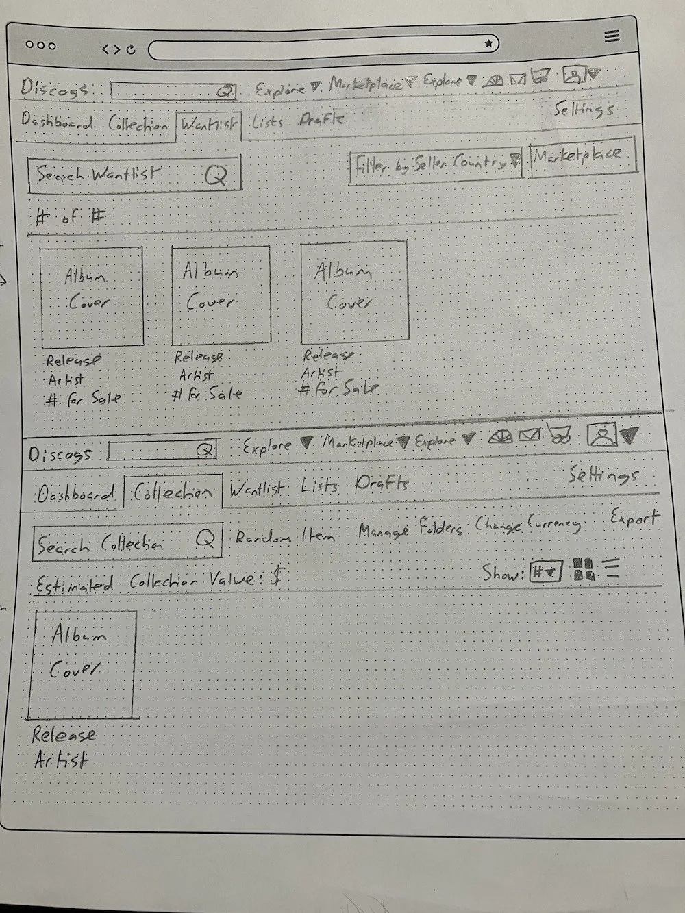
Wantlist Page
User Testing and Design Reviews
I tested the wireframes with the target audience, which are either Discogs members or vinyl collectors.
I also received design reviews from my peers and instructor which helped me identify weaknesses in my redesigned interfaces.
Improvements
For the Release Page, I switched to a layout with a hero section that turned out to be more successful. It contains key information and actions the user can take. A dividing line and change in background color separates this section from the rest of the page.
The current Wantlist icon, an eye, is an odd choice to signify 'favoriting'. To replace it, I chose a star instead of a heart for clarity, since on Discogs, 'loved' records indicate those you own.
The filters I added to the Marketplace and Wantlist page tested successfully, so I stuck to the same interface and user flow for the prototype.
Prototype
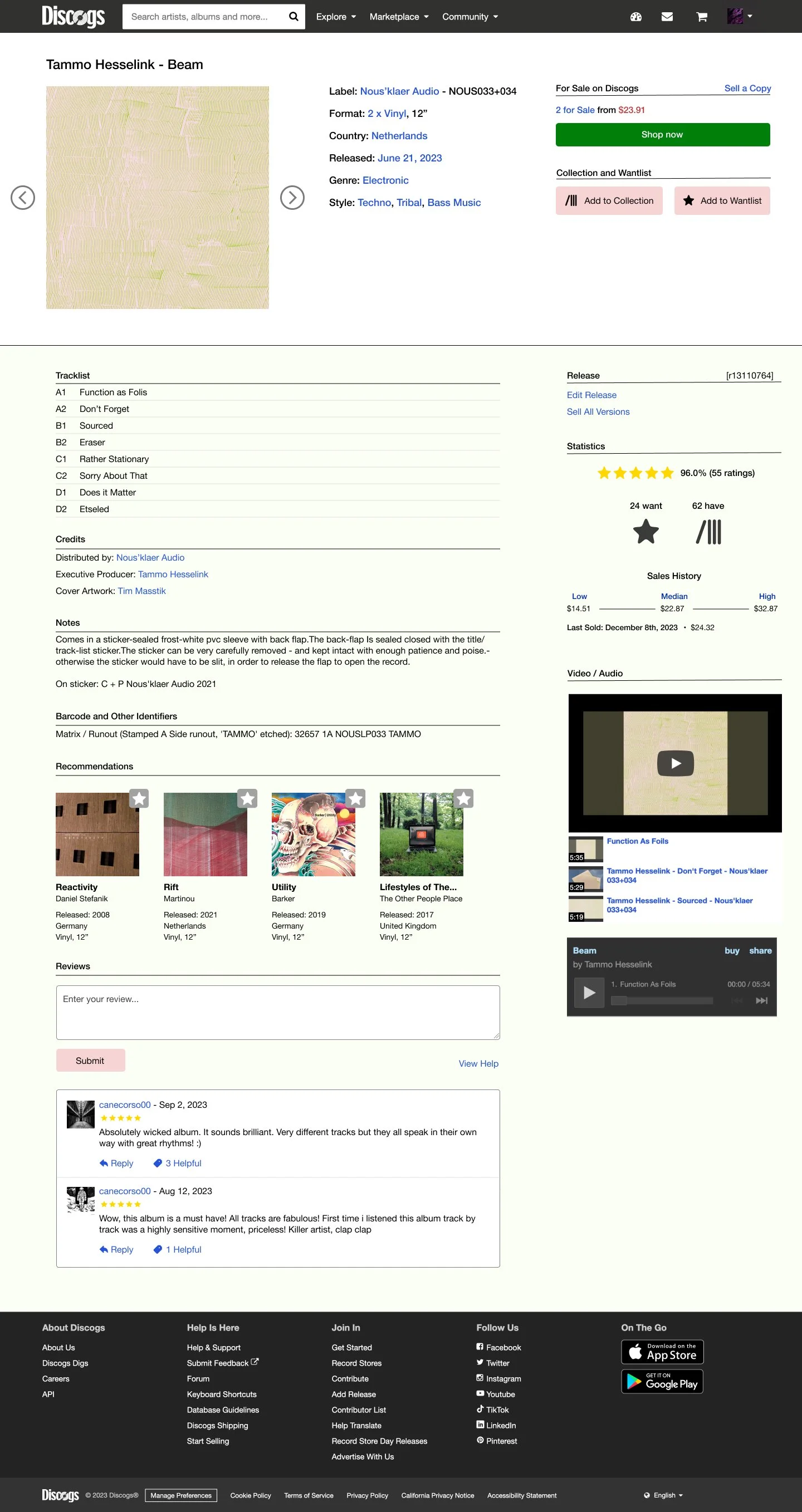
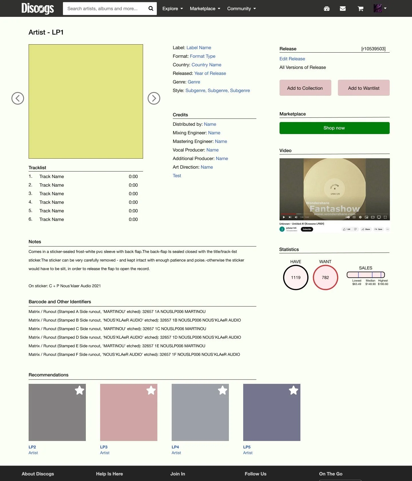
Release Page
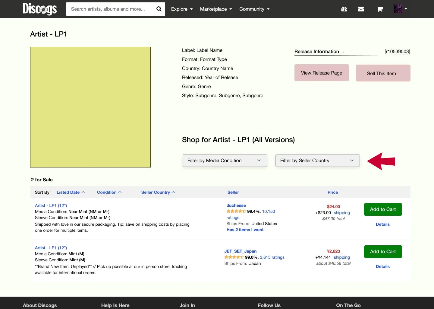
Marketplace Page
Wantlist Page
What I learned from this project
Interface designs for a database must be standardized for millions of entries. The redesign has to work for any cover art as well as missing info.
I was overwhelmed by the complexity of the platform at the start. But then I realized I didn’t need to change everything, just identify problems and then solve them.
I realized the importance of familiarity for users. The database quality of Discogs is likely part of the charm. I was pleased that the Discogs users who viewed the prototype said that it maintains the ‘feel’ of the website.
Future Considerations
There are other cases that need to be considered in this project. Discogs also sells CDs, so the redesign needs to include changes that accommodate that format. The Marketplace page also needs to be viable for multiple releases and formats.
Within the scope of this project, I am confident that the solutions in the redesign address the identified problems and improve the UX on Discogs.