Humber Current
Humber Current is a student showcase for graduates of the Faculty of Media & Creative Arts. My responsive design fixes usability issues and features a solution for recruiters, helping them find the most qualified students.
Timeline:
Sep 2023 - Oct 2023
Skills:
Wireframing, Prototyping, UI Design, Responsive Web Design
Tools:
Figma, Photoshop, Illustrator
Type:
Academic, Solo

Problem
The web application is frustrating for recruiters as it takes too many steps to view student projects. There are numerous usability issues that diminish the user experience.
Objective
Come up with a solution that directly addresses the pain points of recruiters. Redesign the student showcase to make the user experience intuitive and enjoyable for the target audience.
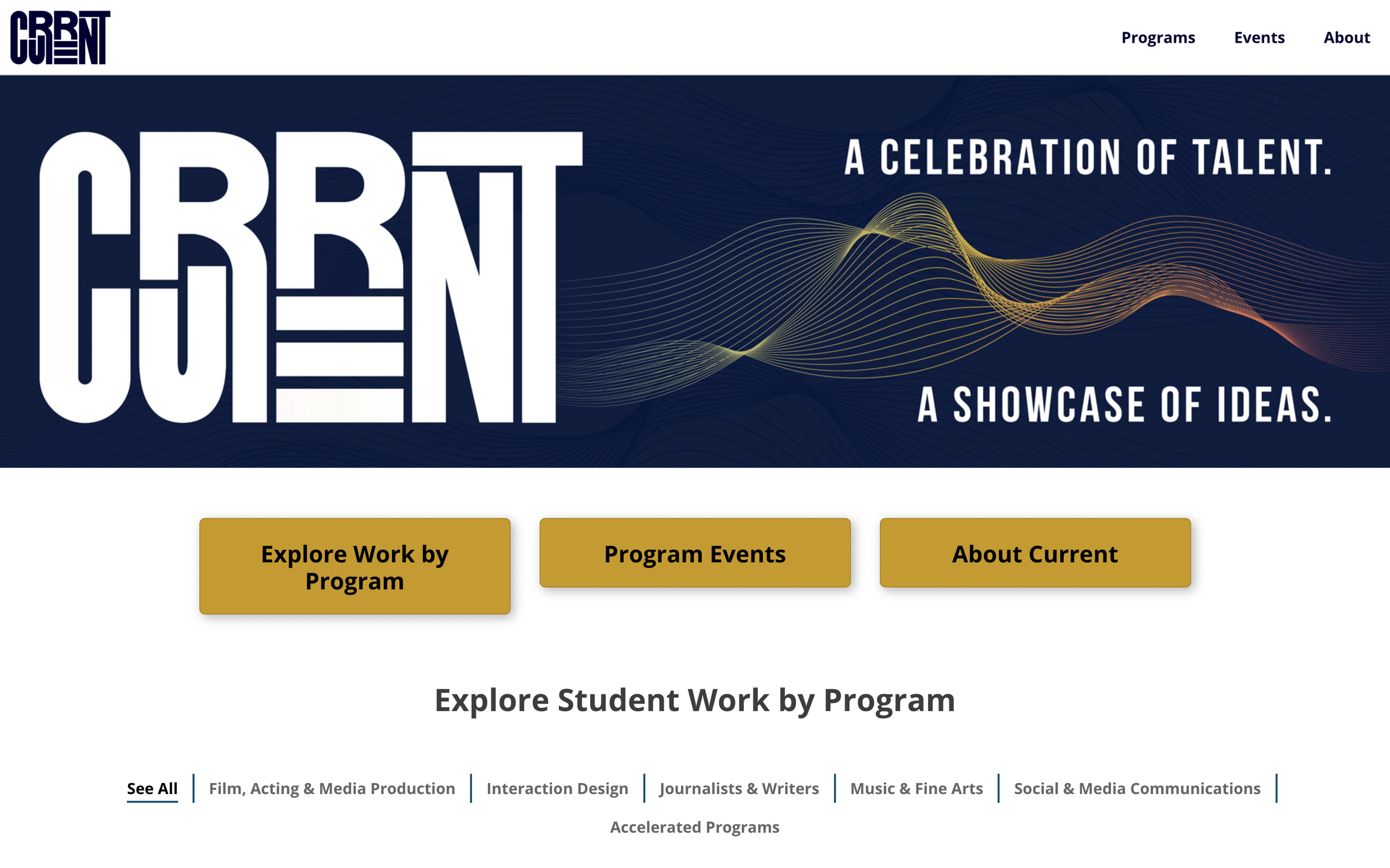
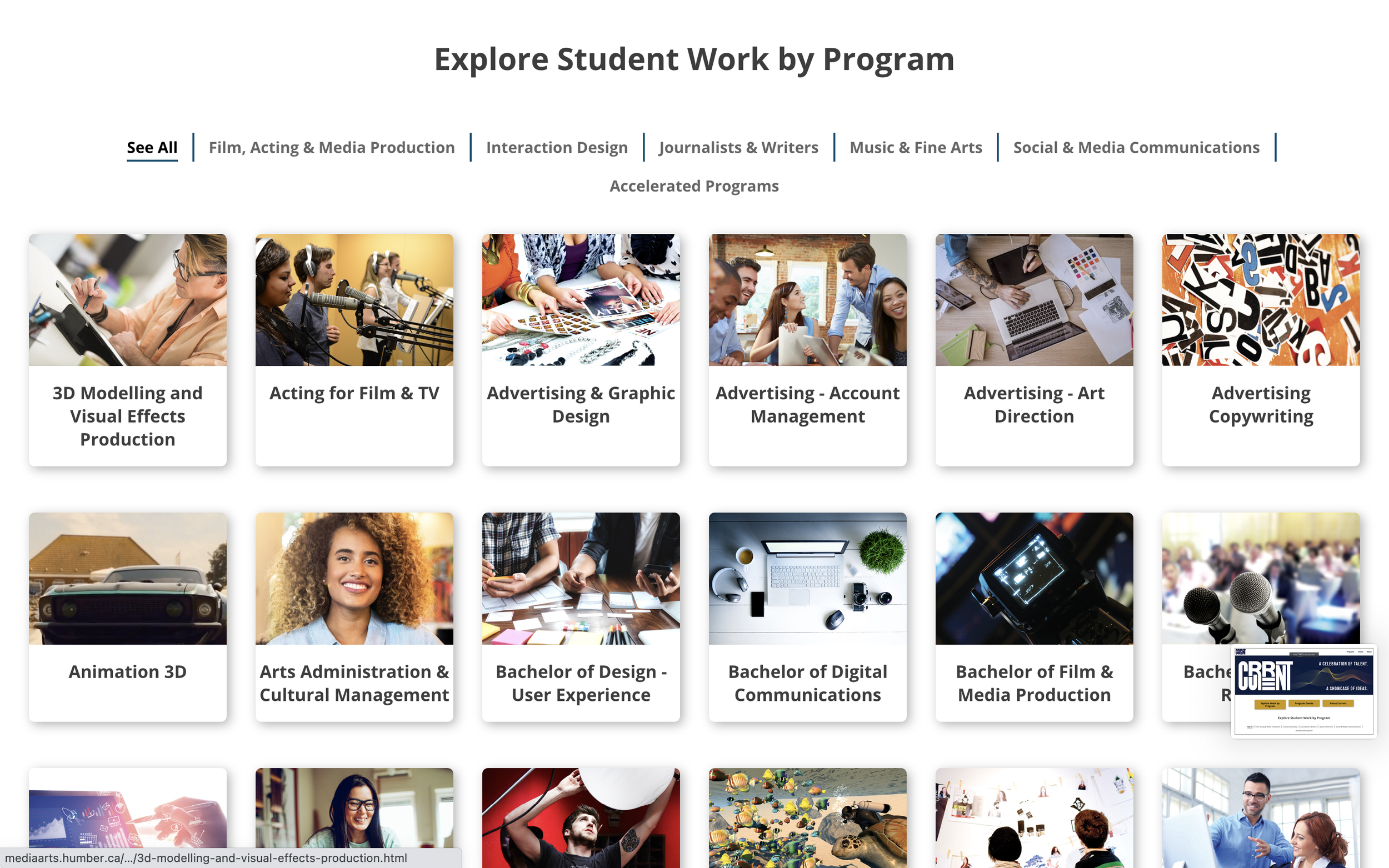
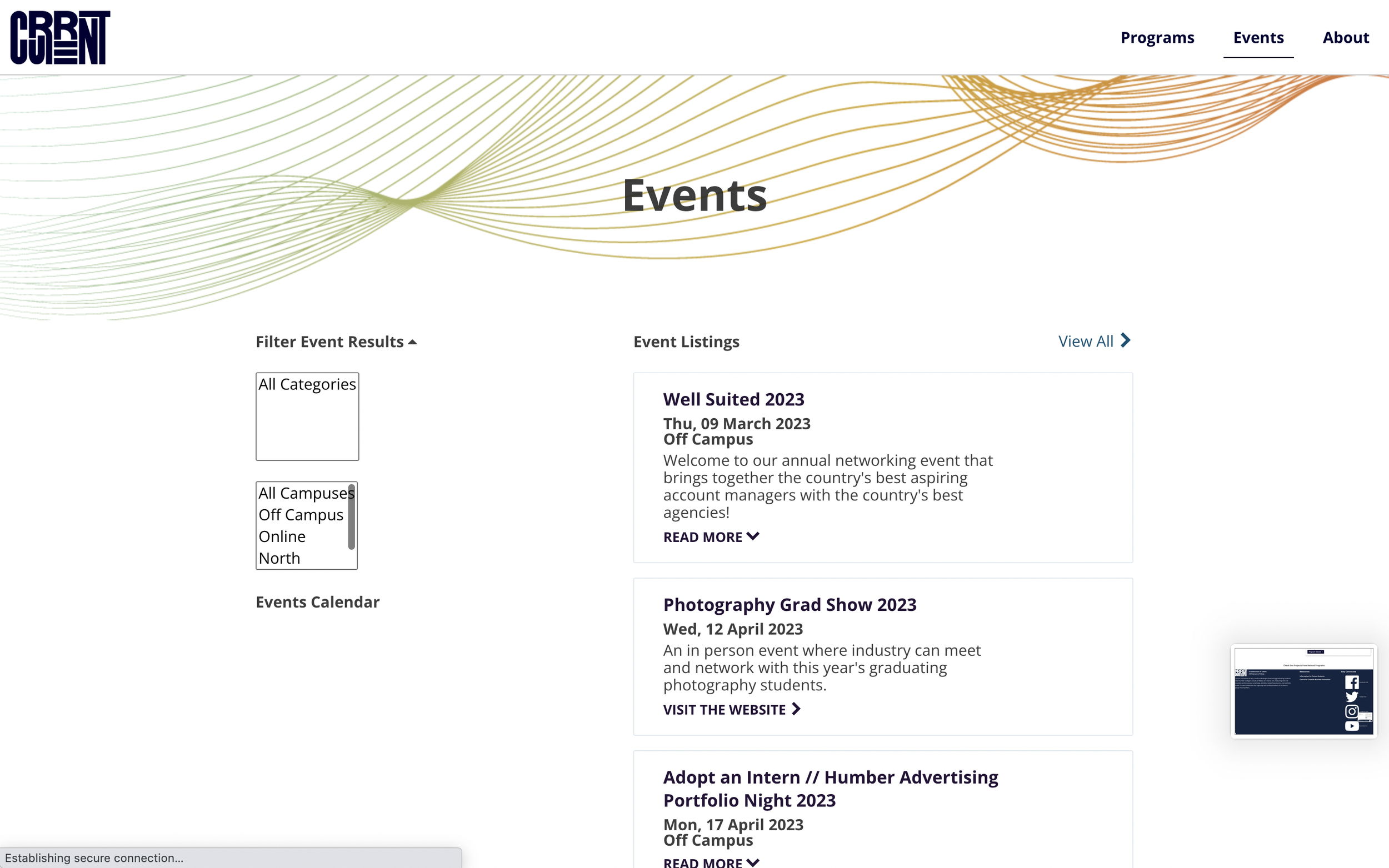
Current Interface

User Research
I focused on recruiters rather than students, since they are the primary audience of the student showcase.
I explored their pain points, created an empathy map and a user persona. Pain points include difficulty in identifying qualified students and limited ways to contact them.
A thorough UX audit helped me identify numerous usability issues with the website. I decided to completely revamp the student showcase in the redesign rather than targeting specific issues for fixing.
Solution for Recruiters
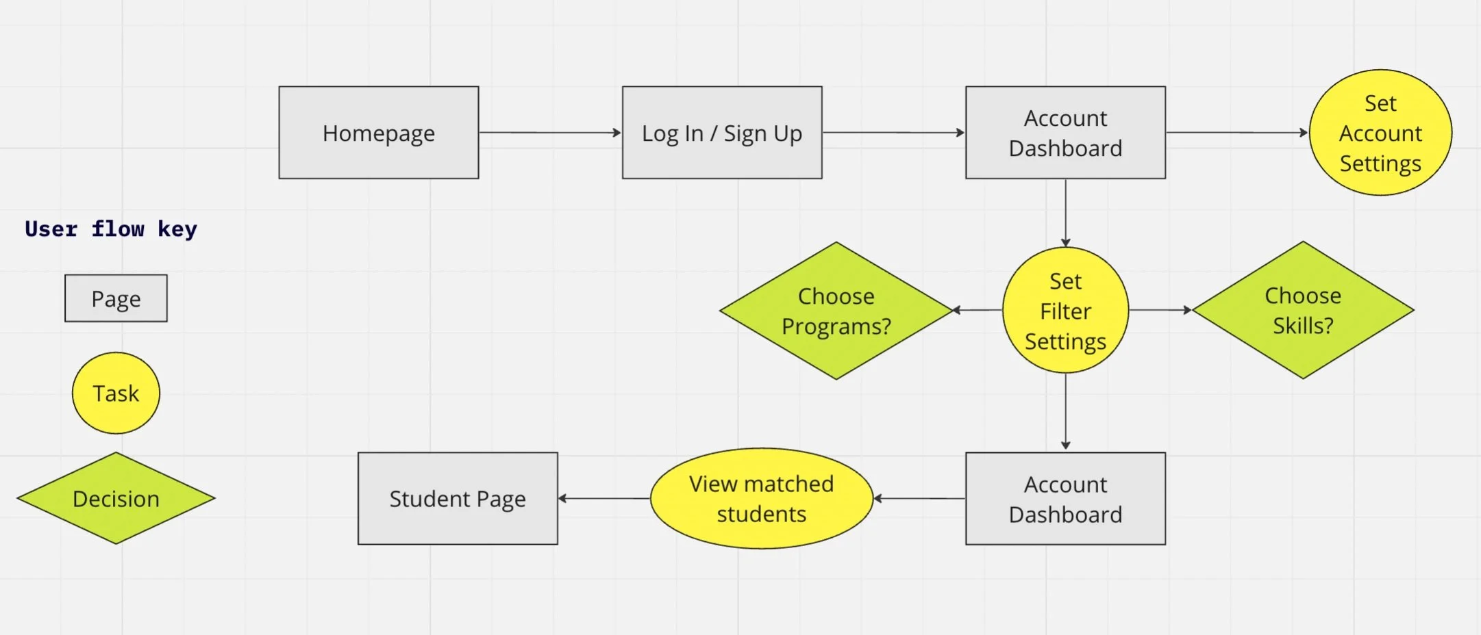
One problem with the website is that it takes too many steps to reach a student’s profile, and they might not match the requirements that the recruiter is looking for. What if they could filter directly for students that meet their requirements?
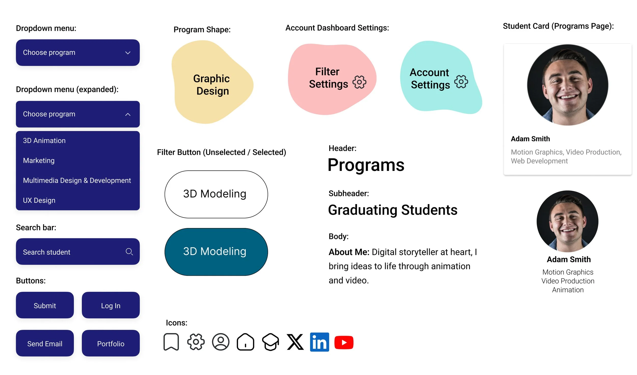
I came up with a solution: filter settings that allow recruiters to choose the programs and skills they are looking for. After setting the filters, they are matched with students that meet those qualifications. An account dashboard presents the matched students.
User Flow
Sketches
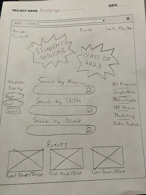
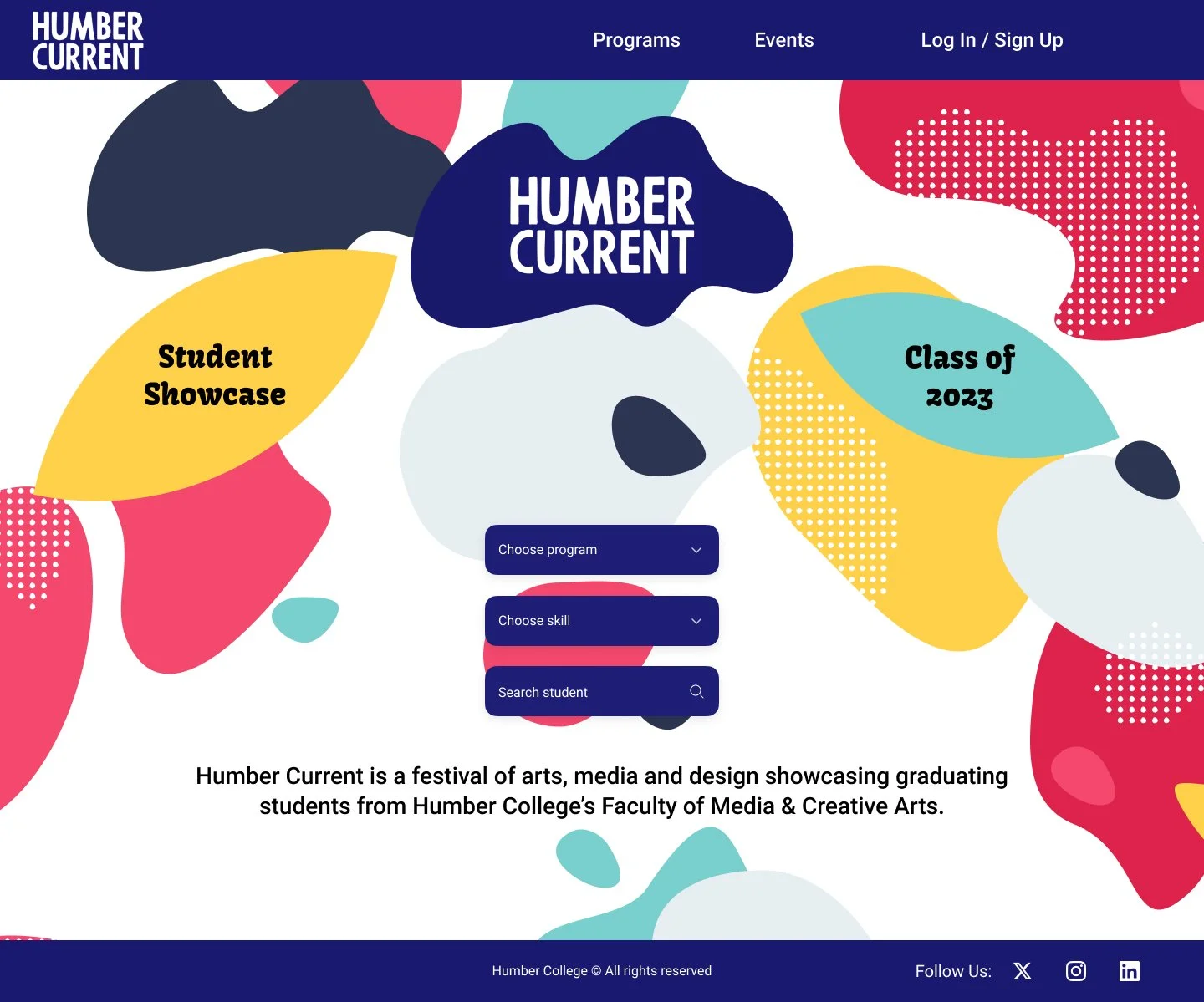
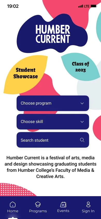
Homepage (Layout A)
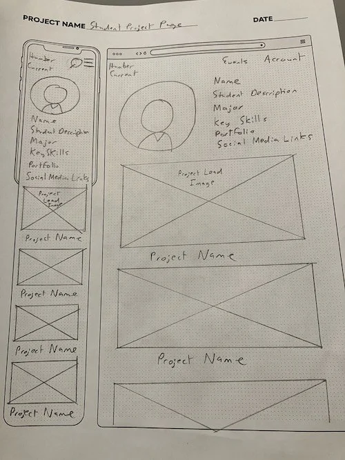
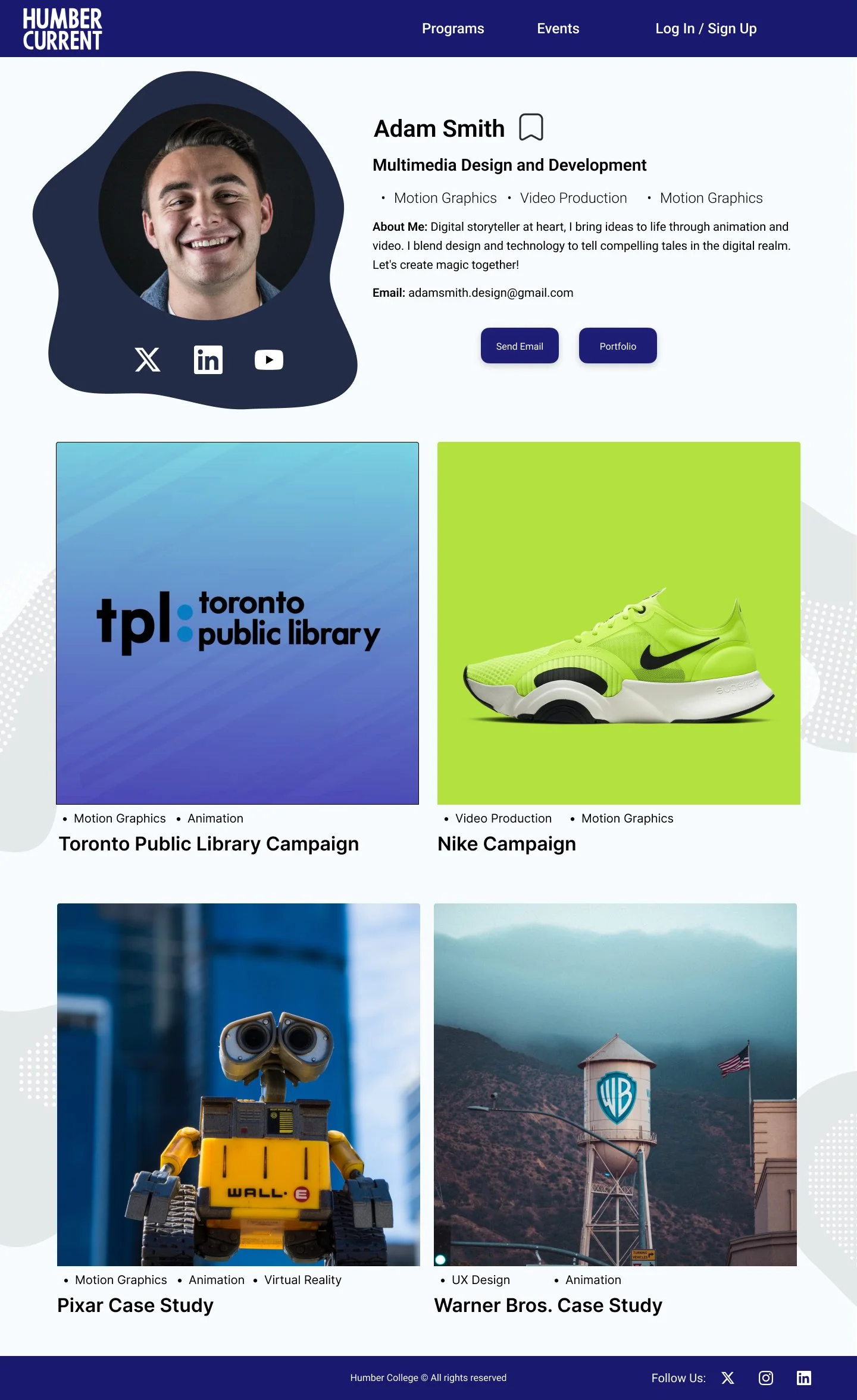
Student Profile Page
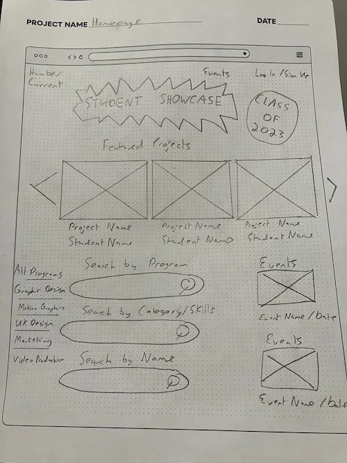
Homepage (Layout B)
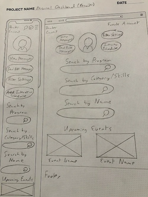
Account Dashboard (Recruiter)
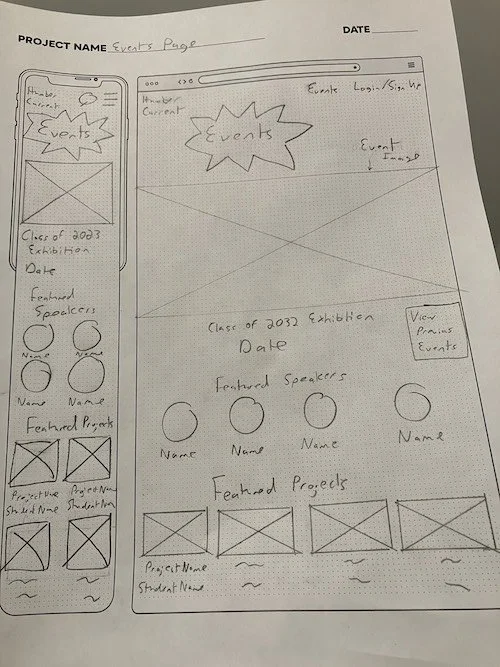
Events
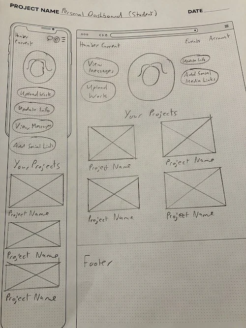
Account Dashboard (Student)
Wireframes (Desktop)

Homepage

Account Dashboard (Recruiter)
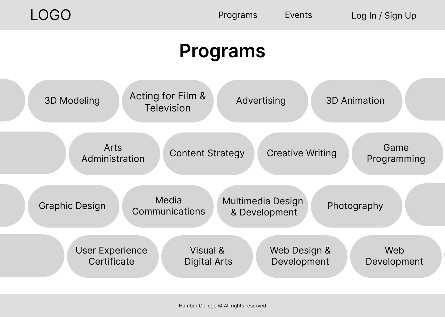
Programs Page

Student Profile Page
Wireframes (Mobile)

Homepage

Account Dashboard
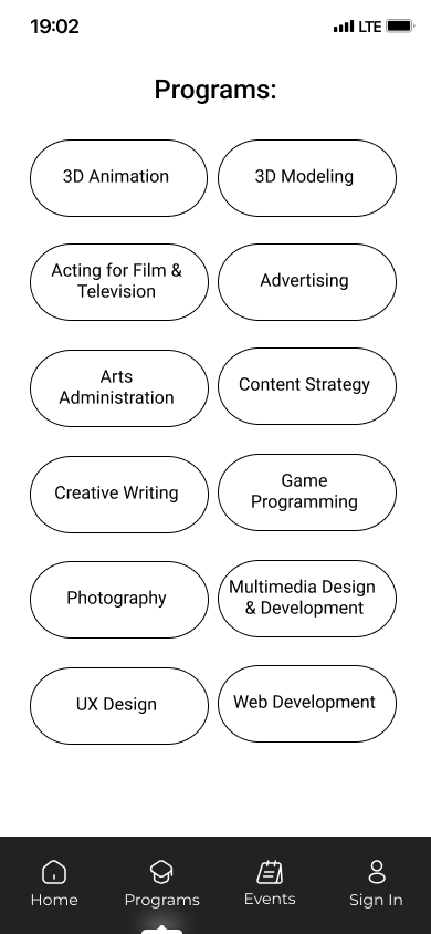
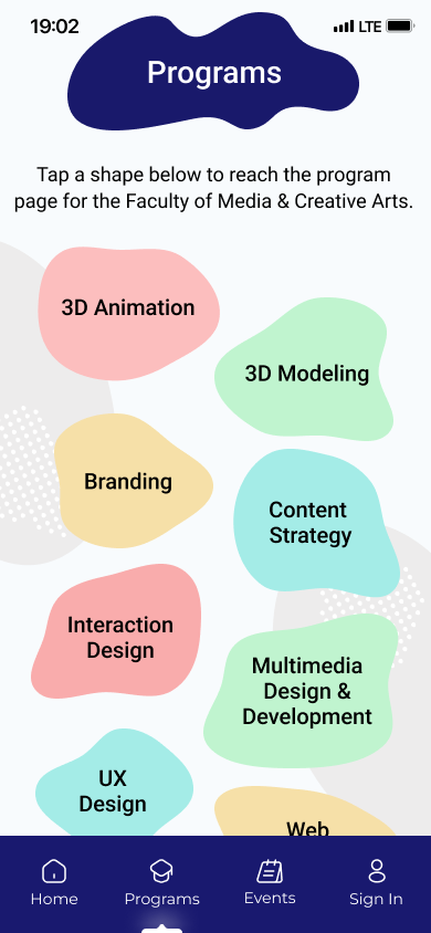
Programs Page

Student Page
User Testing and Design Reviews
I conducted 5 user tests to identify usability issues and solve them.
I also completed 5 design reviews to obtain suggestions on improving the visual design and user experience.
Improvements
I maintained visual consistency by adding the shapes on the homepage throughout the website. I kept them greyed out and at lower opacity to not distract from the content.
Some users didn’t understand how to access the filter settings from the account dashboard. I improved visual hierarchy by shifting the instructions to the top of the page, below the header.
The Student Profile page did not communicate information in an easily understood manner. I reorganized the student profile to make their key information and contact methods more clear.
UI Kit
Prototype (Desktop)
Homepage

Account Dashboard (Recruiter)

Programs Page
Student Profile Page
Prototype (Mobile)
Homepage

Account Dashboard
Programs Page

Student Page
What I learned from this project
Balance aesthetics with functionality. I wanted a vibrant and visually appealing design, but I had to keep usability at the forefront of my mind. Design has to serve function.
Test early. The account dashboard went through multiple revisions before I reached an effective interface. Early testing on the wireframes helped me identify key issues to fix.