Magari
Designed a native iOS app for an ecommerce furniture store. I leveraged UX metrics to measure the impact of design improvements from wireframes to prototype, successfully reducing the task time by 14% for purchasing a product.
Timeline:
Nov 2023 - Dec 2023
Skills:
Branding, Wireframing, Prototyping, Usability Testing
Tools:
Figma, Illustrator, Substance 3D Stager
Type:
Academic, Solo
Problem
Magari is a team of industrial designers who make bespoke furniture, and they need a platform where they can sell these custom pieces. How can the app meet this need while appealing to a specific target audience interested in the production process?
Objective
Design an iOS app for Magari that is intuitive, user-friendly and makes use of device features. Shoppers should get insight into production and have access to sellers for questions.
User Research
I conducted three in-depth interviews to establish the target audience and two user personas. These user personas helped guide my design decisions (one of the user personas is displayed below). Additionally, I performed a SWOT analysis on two competitors to identify gaps in the market that Magari can fill.
Target audience:
24-45 years old
Middle to upper-middle class, live in urban areas
Express personal style through home decor
Value sustainable and ethical production
User Persona:

Competitor Analysis:
I identified two competitors, Etsy and 1stDibs, and performed a SWOT analysis.
I found that both Etsy and 1stDibs make it difficult to discover emerging sellers and lack detailed information about how they crafted their products.
Sketches
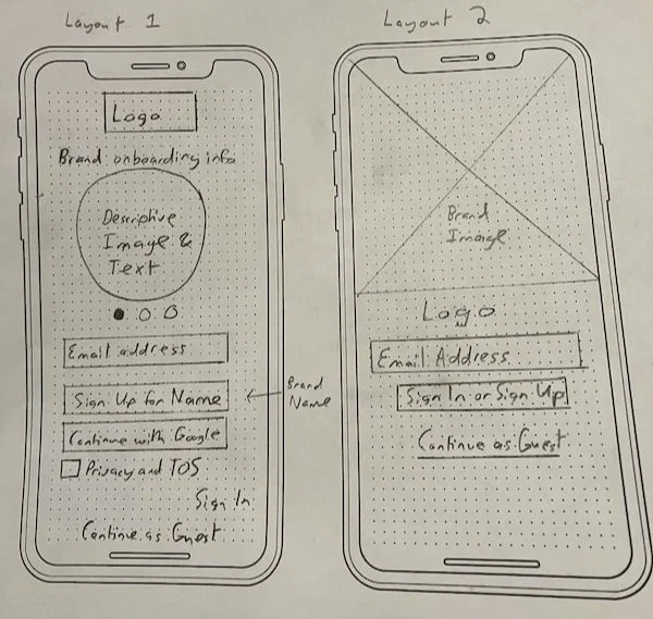
Log In / Sign Up Page

Homepage
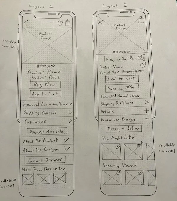
Product Page
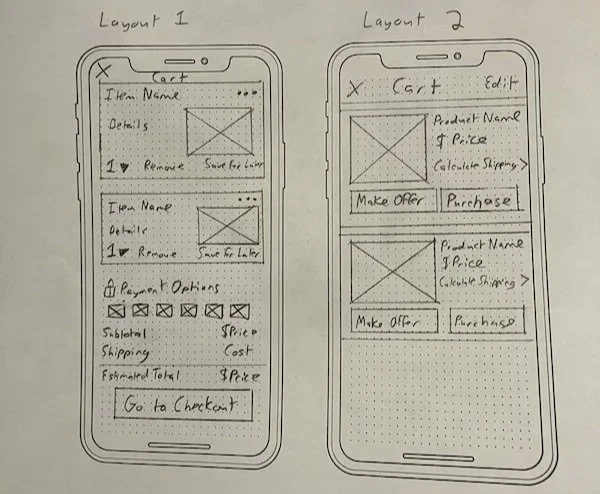
Cart Page
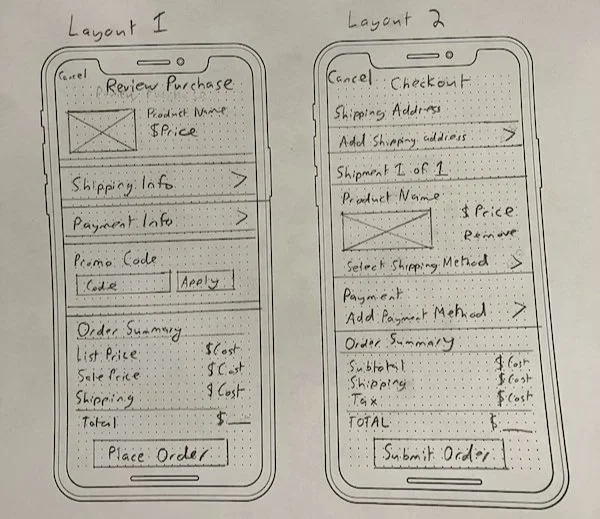
Checkout Page
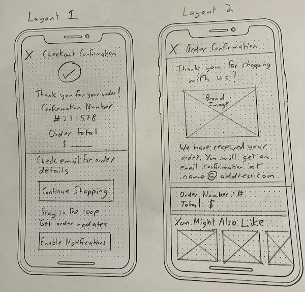
Order Confirmation Page
User Flow
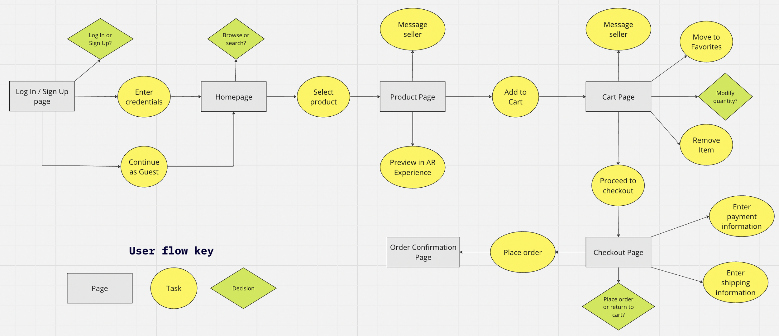
Primary user flow for the ecommerce app: Log In to Order Confirmation
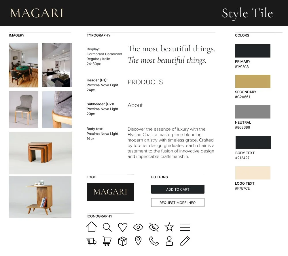
Style Tile
3D Models
I customized textures and generated images for the furniture using Substance 3D Stager.

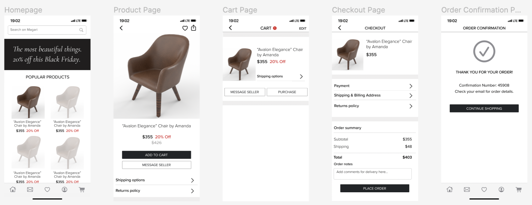
Mid-Fidelity Wireframes:
User Testing
I carried out a round of testing on the wireframes and a round of testing on the prototype. Each round of testing involved 5 user tests.
There were 4 tasks in each test, and 3 UX metrics were recorded for each task.
Tasks
Task 1: Buying a product (primary user flow)
Task 2: Finding product details
Task 3: Adding and removing from cart
Task 4: Favoriting a Product
Metrics
Task completion
Average task time
Single Ease Question (SEQ)
Improvements after Testing
While testing the wireframes, I discovered a common usability issue: users struggled with the functionality for adding and removing items from the cart.
Initially, my design required users to tap an 'Edit' button to modify cart contents, but testing revealed that this wasn't intuitive. To address this, I made several design adjustments. First, I added an underlined 'Move to Favorites' link above the shipping options, which directly guided users on how to save items for later purchase. Additionally, I introduced a swipe gesture for mobile, providing an alternative method for quickly removing items from the cart or adding them to favorites.
I compared the results of the rounds of testing to measure the impact of my design improvements from the wireframes to the prototype.
I successfully reduced the average task time for buying a product (task 1) by 14%.
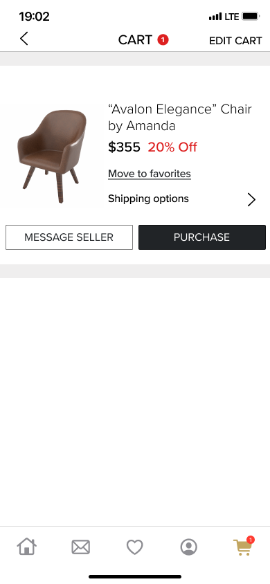
Clarified user actions on Cart Page
Task 3: 25s → 17s

Replaced text with short-form video
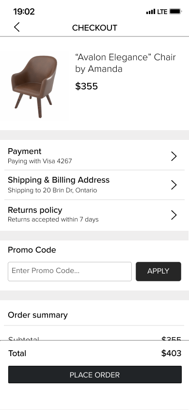
Added pre-filled info to Checkout Page
Task 1: 42s → 36s
Prototype

App Features
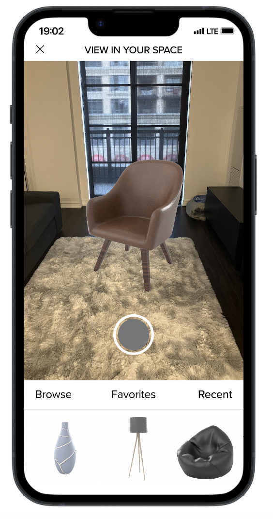
AR viewing allows the user to view the product within their space. They can also add additional products to see how they work together in the room.
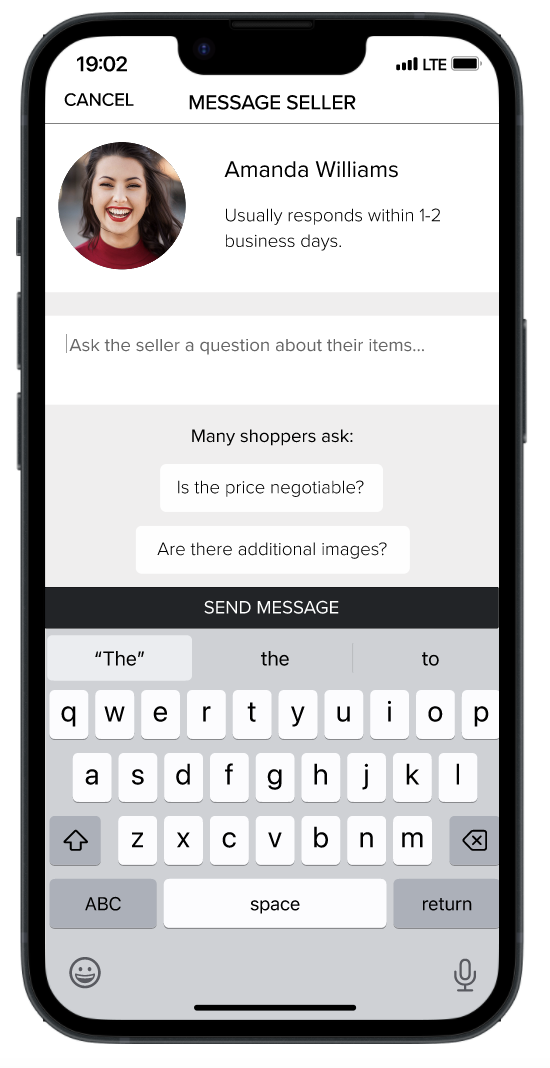
Users can also contact sellers to ask them questions before buying. Common questions that shoppers ask can be added to the message for convenience and ease of use.
What I learned from this project
Don’t make designs too minimal. Users couldn’t figure out how to achieve some of the actions on the wireframes because the affordances weren’t clear.
Give users alternate ways to do stuff. Mobile gestures provided more flexibility for completing actions and made the app more user-friendly.
